
Think of A+ Content as your product’s backstage pass: the place where you go beyond specs and show why your brand is worth choosing. It’s where you can tell a richer story, overcome the final objections, and help the shopper feel confident they’ve found “the one.”
The Answer
Use your A+ space to simplify the decision. Show the shopper what makes your product different, how it fits their life, and why it’s worth the price, all in a clean, on-brand design that loads beautifully on mobile.
Amazon’s constraints
- Format: Use approved modules only (Basic or Premium A+).
- Size: Pixii’s Basic full-image modules use 970 × 600 pixels. Premium Full Image uses 1464 × 600 for desktop and 600 × 450 for mobile. The 970 × 300 Basic text-overlay slot is a different module. See our A+ Content guide for sizes and uploads, with Amazon’s Basic specifications and Premium specifications.
- Alt text: Required for every image (good for accessibility and SEO).
- No prohibited content: Avoid warranty claims, shipping guarantees, or promotional pricing.
- Branding: Must match your registered brand assets in the Brand Registry.
How to win
A+ Content earns its keep when it:
- Tells a visual story – Lead with images, use text sparingly to support key points.
- Highlights differentiators – Make it obvious why yours is the better choice.
- Includes comparison charts – Show other products in your line and why this one fits.
- Speaks benefits, not just features – Frame every detail in terms of what it does for the shopper.
- Feels cohesive – Stick to a consistent color palette, typography, and photography style.
- Works on mobile first – Design so the message still lands in a vertical scroll.
Pro tip Use the “Brand Story” section above the bullets to connect emotionally. Then let your A+ modules dive into specifics and side-by-side visuals that remove lingering doubt.
The Checklist
- ✅ Approved modules used correctly
- ✅ Clear visual hierarchy
- ✅ High-quality images with alt text
- ✅ Comparison chart included
- ✅ Consistent, on-brand design
- ✅ Mobile readability tested
Why this works
A+ Content is often the last step in the shopper’s decision-making process. When it reinforces the value, answers remaining questions, and feels professionally crafted, it tips the scale toward purchase without requiring more traffic or ad spend.
What Winning Looks Like
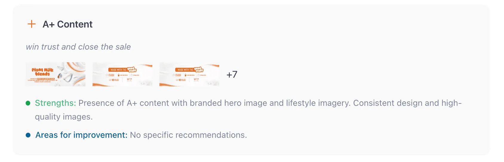
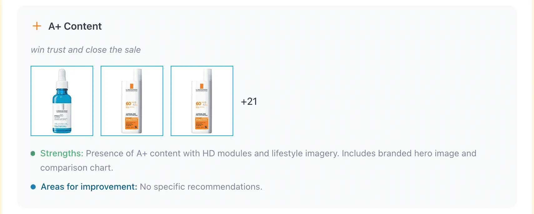
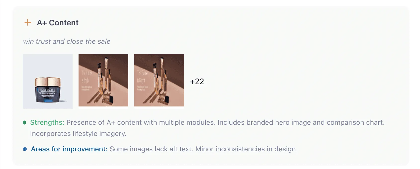
Below are examples of A+ Content modules that combine strong visuals, brand storytelling, and comparison charts to close the sale. All these titles scored 13-15 out of 15 on Pixii’s Listing Grader.
Check out the full upgrade series:
📱 Increase Amazon Conversion Rate Without More Ads: A Practical Guide For Faster Add‑To‑Cart
📸 Amazon Main Image Best Practices: How to Create a Hero Image That Gets Clicks
🧾 Amazon Supporting Images: How to Build a Gallery That Converts
💡 Amazon Product Title Best Practices: How to Write Titles That Sell
📊 Amazon Bullet Points Best Practices: How to Write Key Features That Convert
🔍 Amazon A+ Content Best Practices: How to Design Modules That Convert
🧾 Amazon Reviews Best Practices: How to Get More 5-Star Ratings and Increase Conversions
Authors: Monte Desai(Founder @ Pixii)


